Design Kit for Dashboards & Web Apps
The ultimate design kit for web apps, dashboards, and data-driven design with a clear and consistent design system.
-
How does it work?
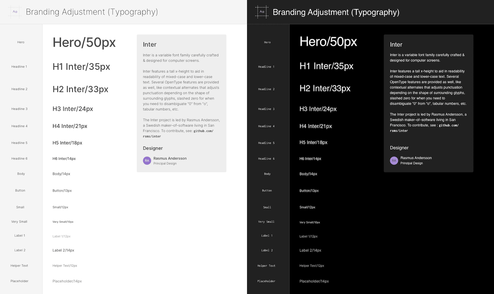
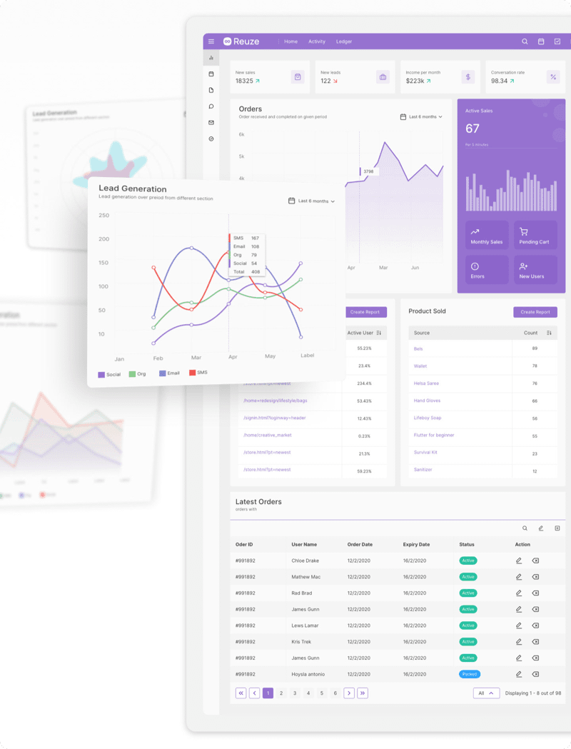
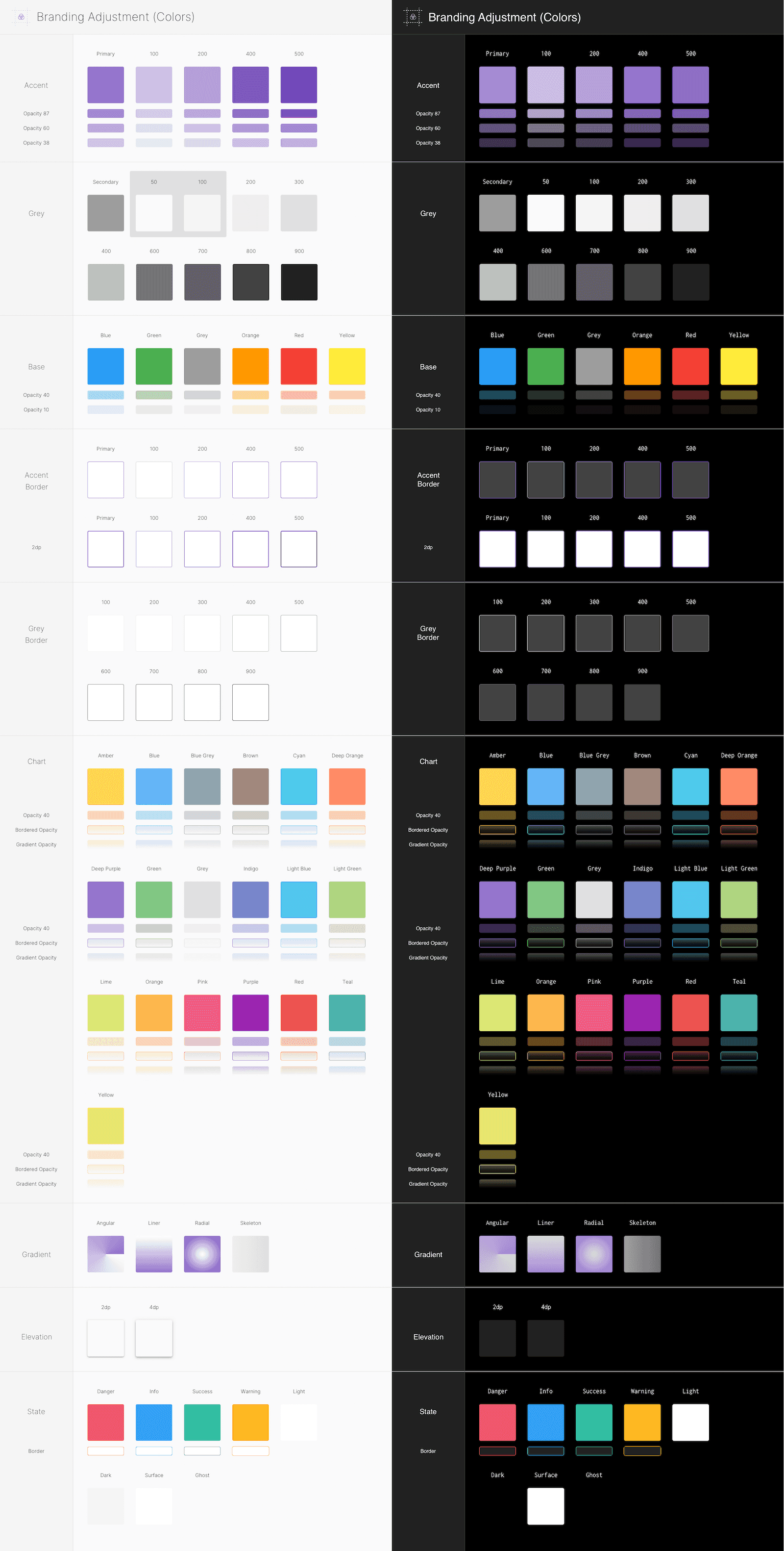
This is an amazing resource for designing or prototyping dashboards, web apps and any type of data-driven product. Because of its organization, it’s ideal for new and experienced designers. The Branding Adjustment section will allow you to quickly customize the colors and typography of hundreds of symbol-driven components.
With over 1600 strategically grouped and organized elements, you will be able to quickly drag-and-drop, customize or mix-and-match components. You will be able to choose between Dark and Light component versions and explore pre-designed web applications.
What's included?
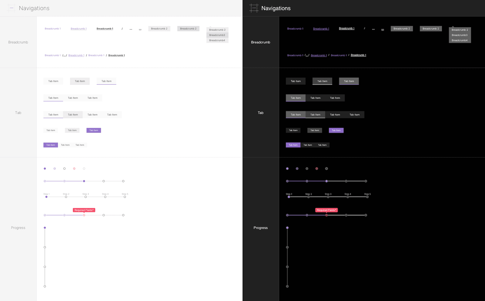
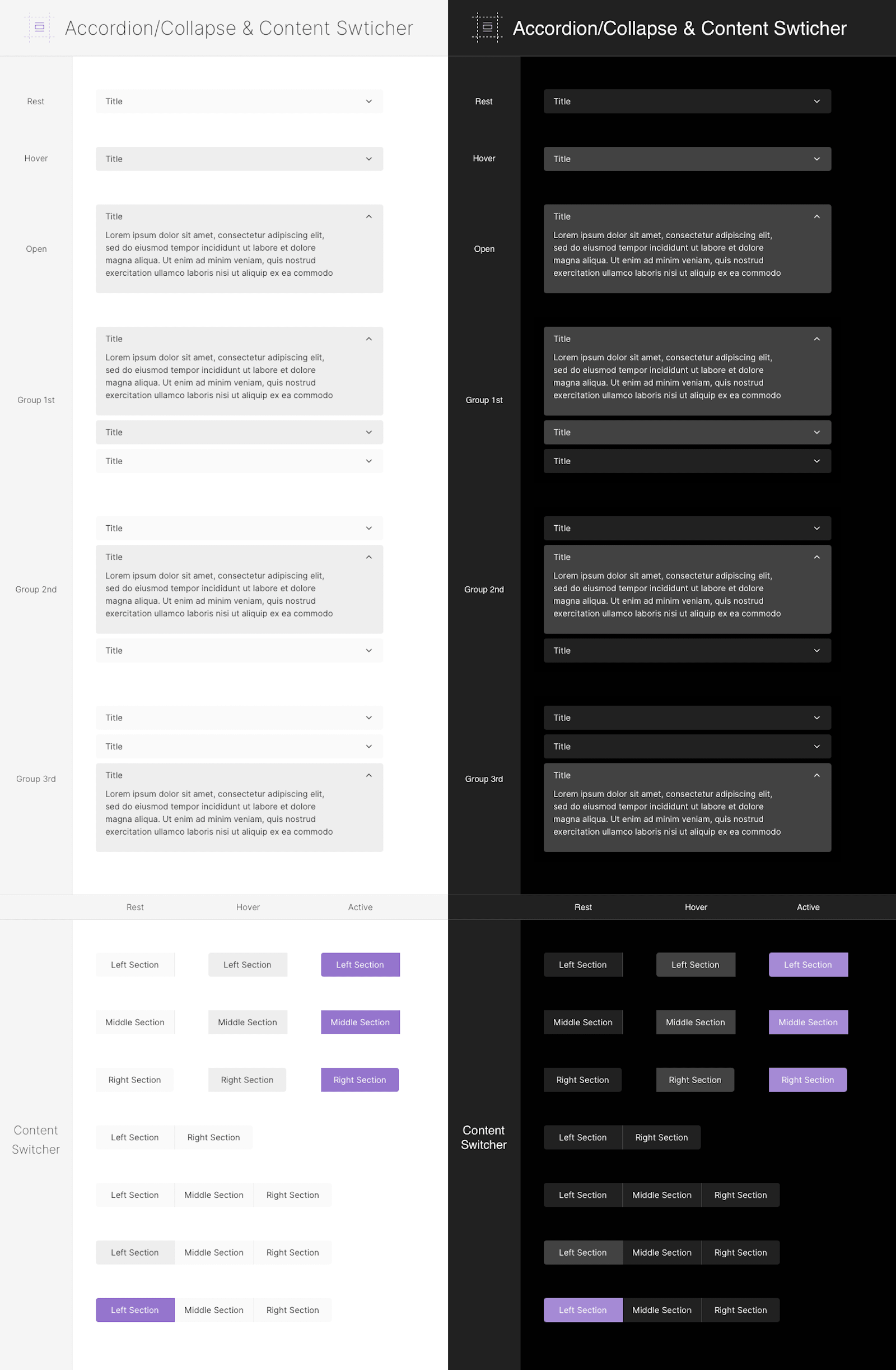
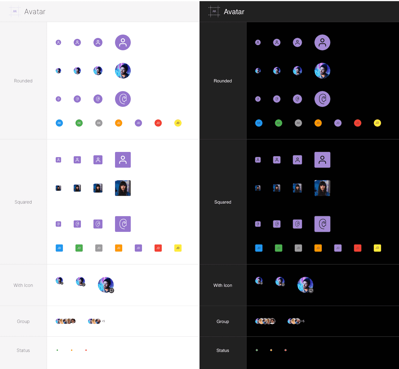
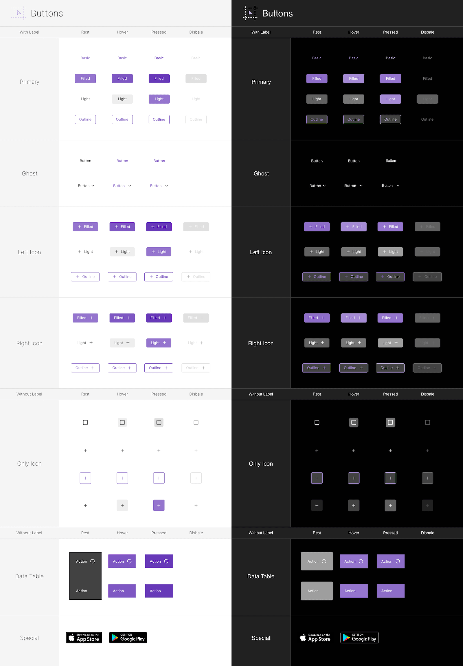
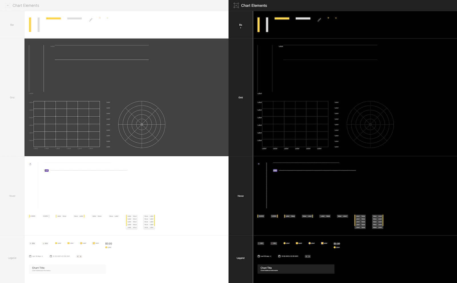
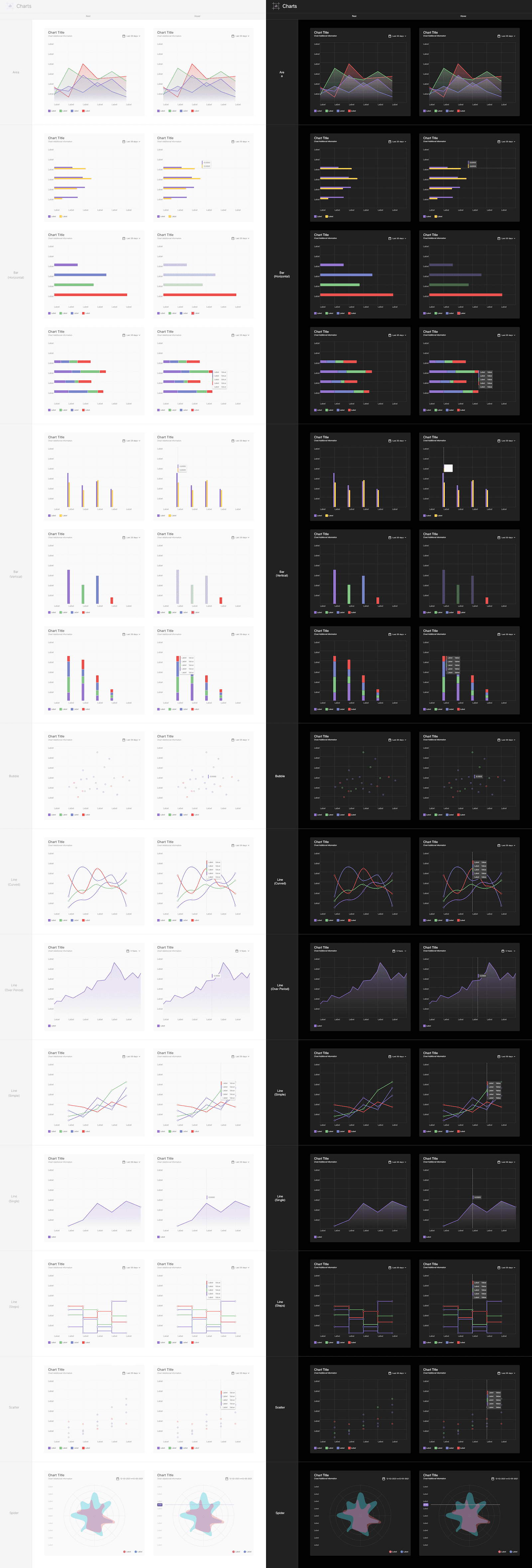
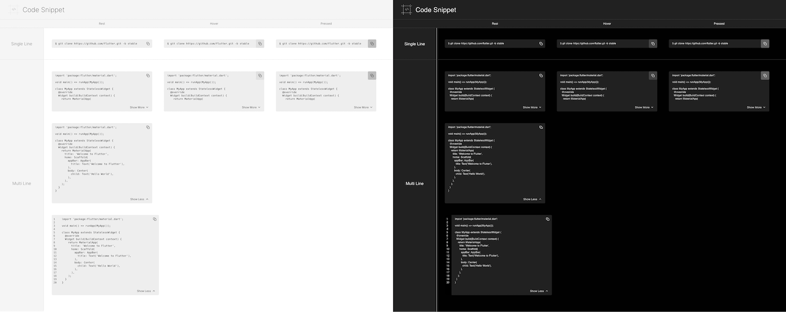
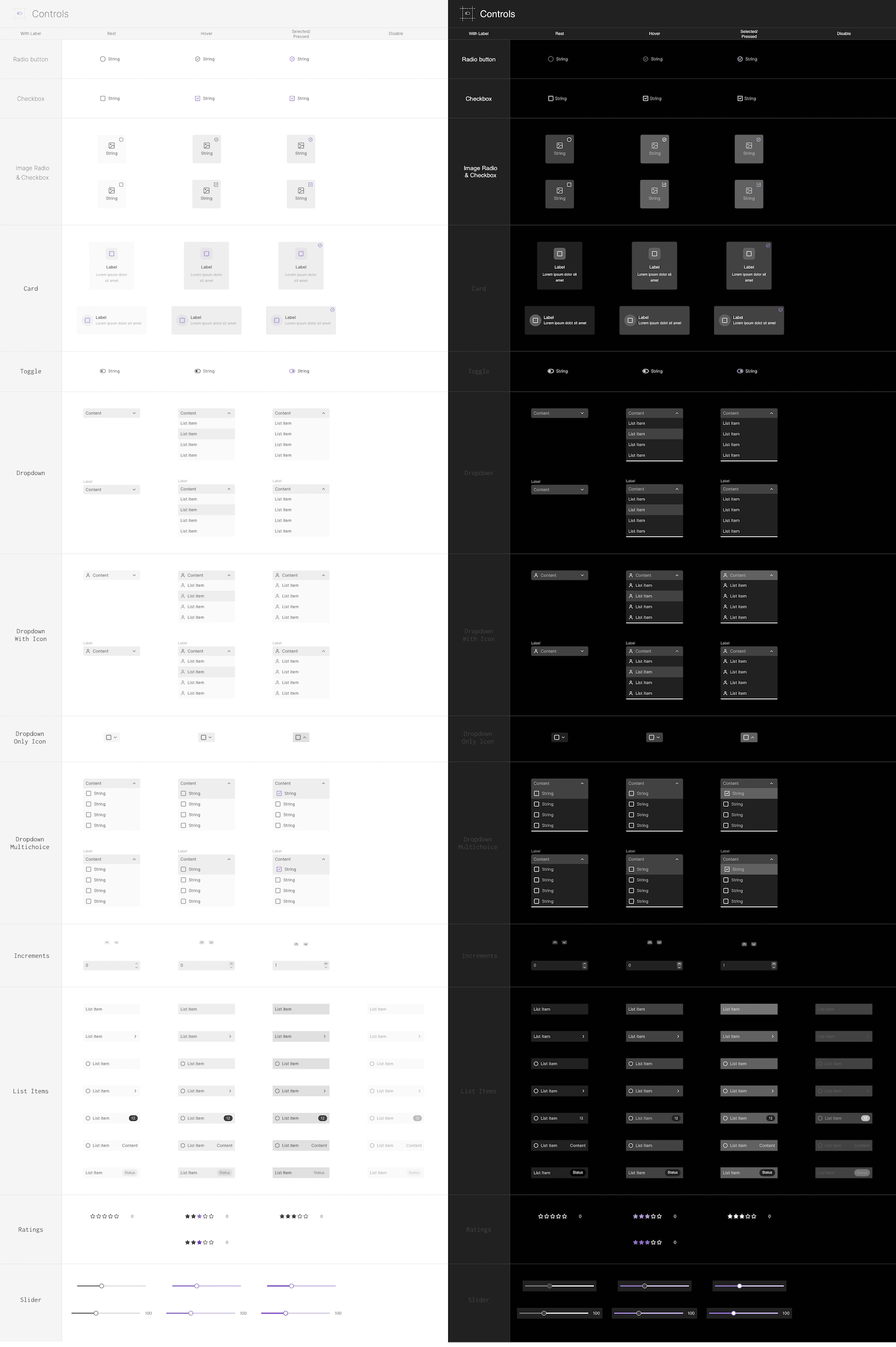
Over 1600 components that are carefully organized in multiple categories: Buttons, Text Fields, Complex Text Fields, Form Controls, Form Inputs, Accordion & Content Switchers, Navigation, Views, Pickers, Charts & Chart Elements, Small Charts & Cards, Avatars, Media Elements, Code Snippet Previews, Tables, Pop-ups & Modals.
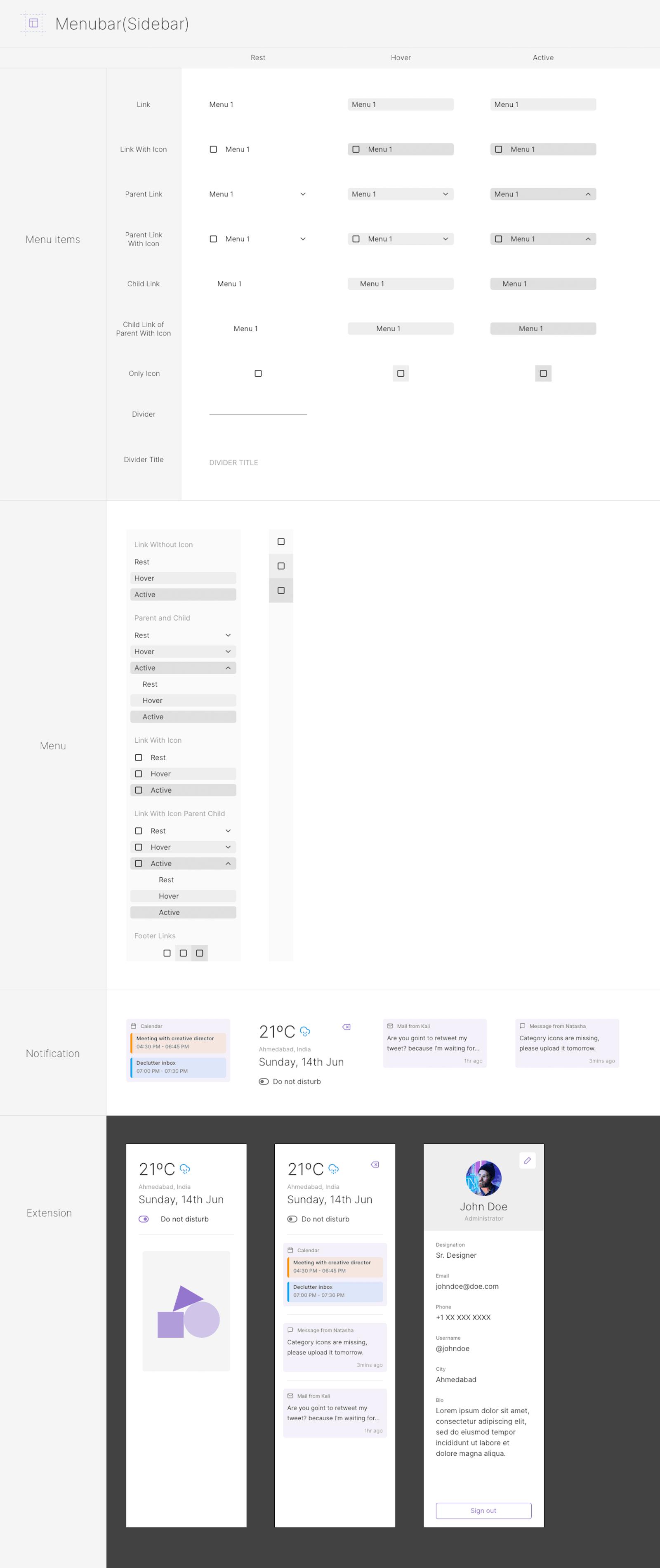
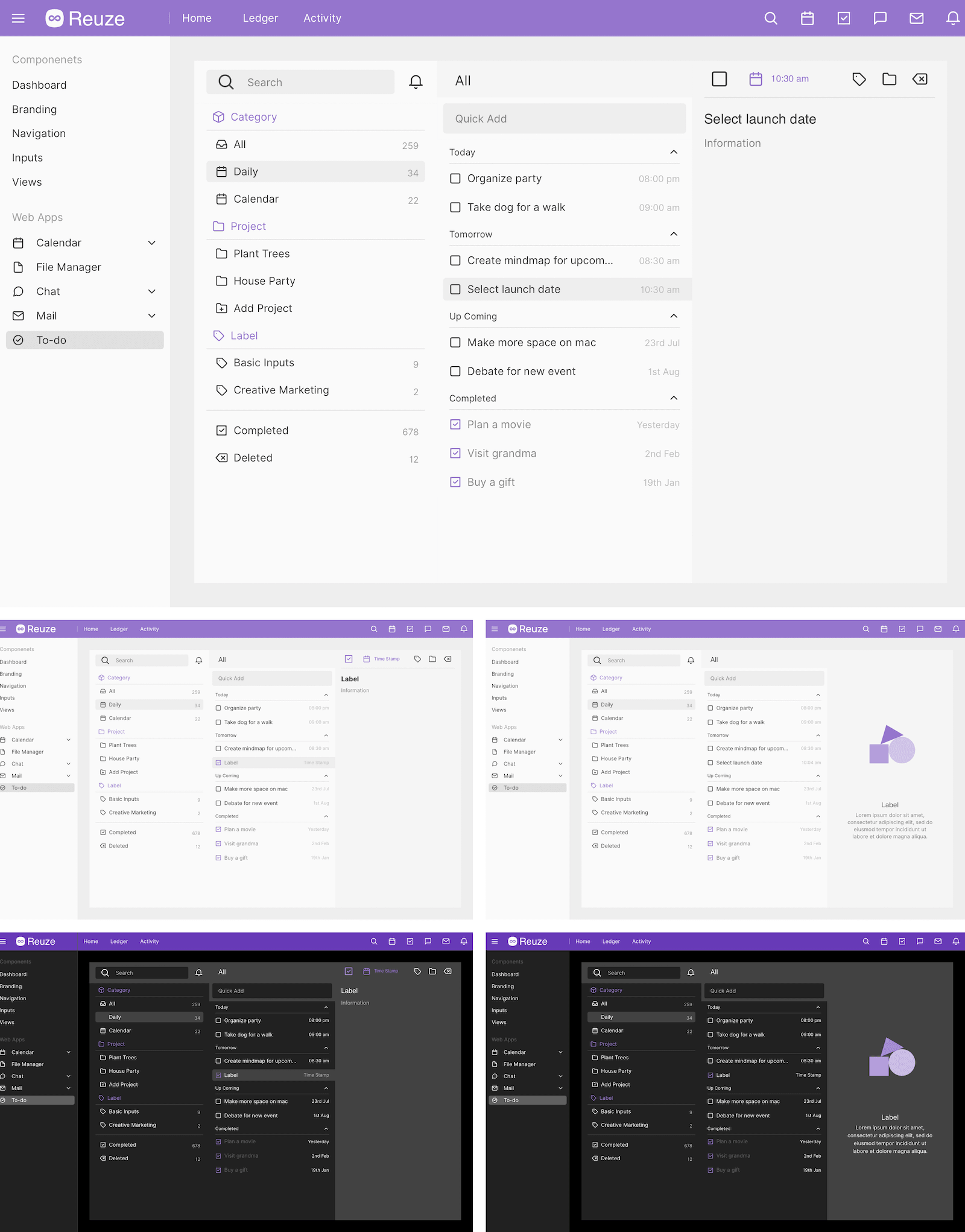
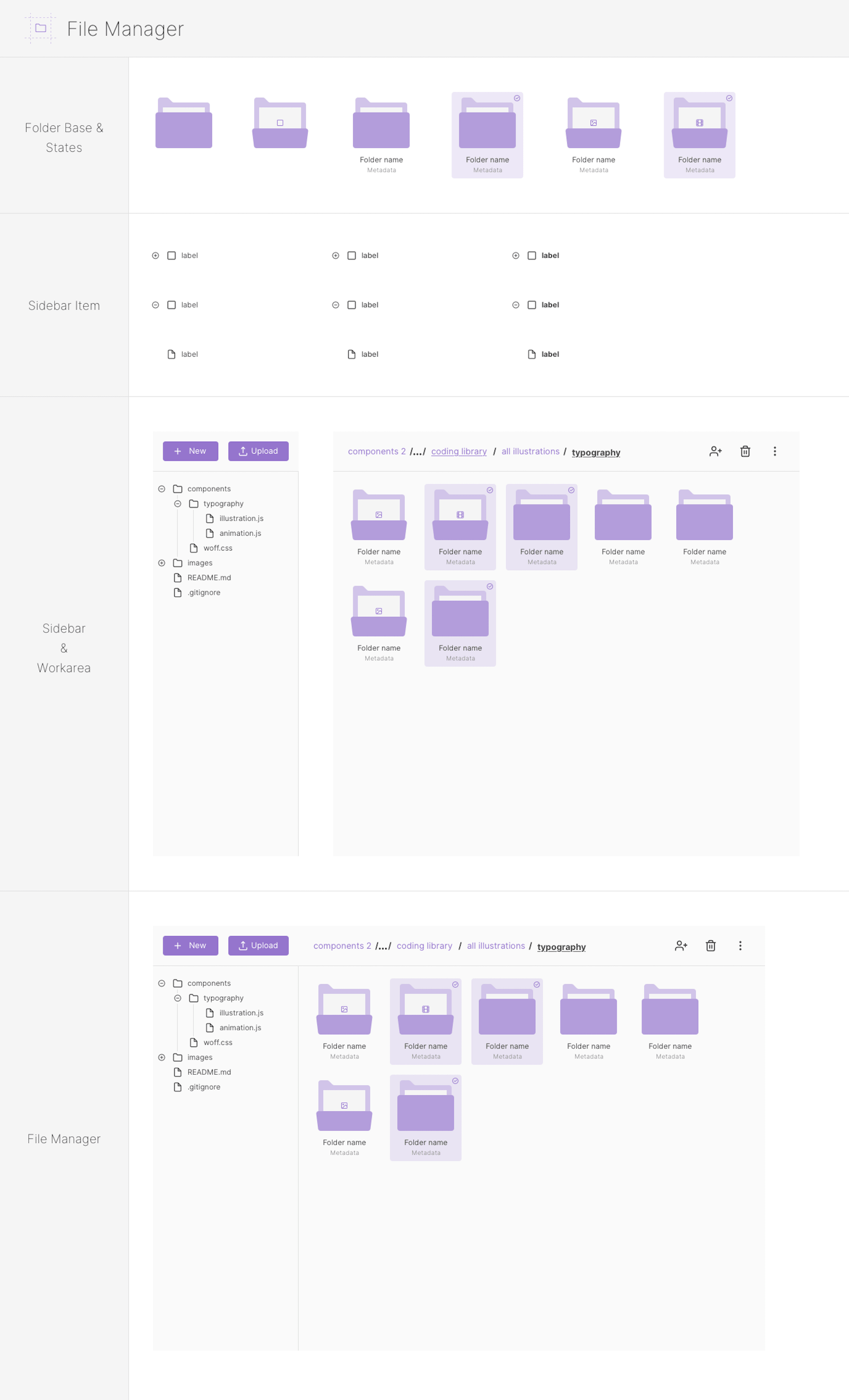
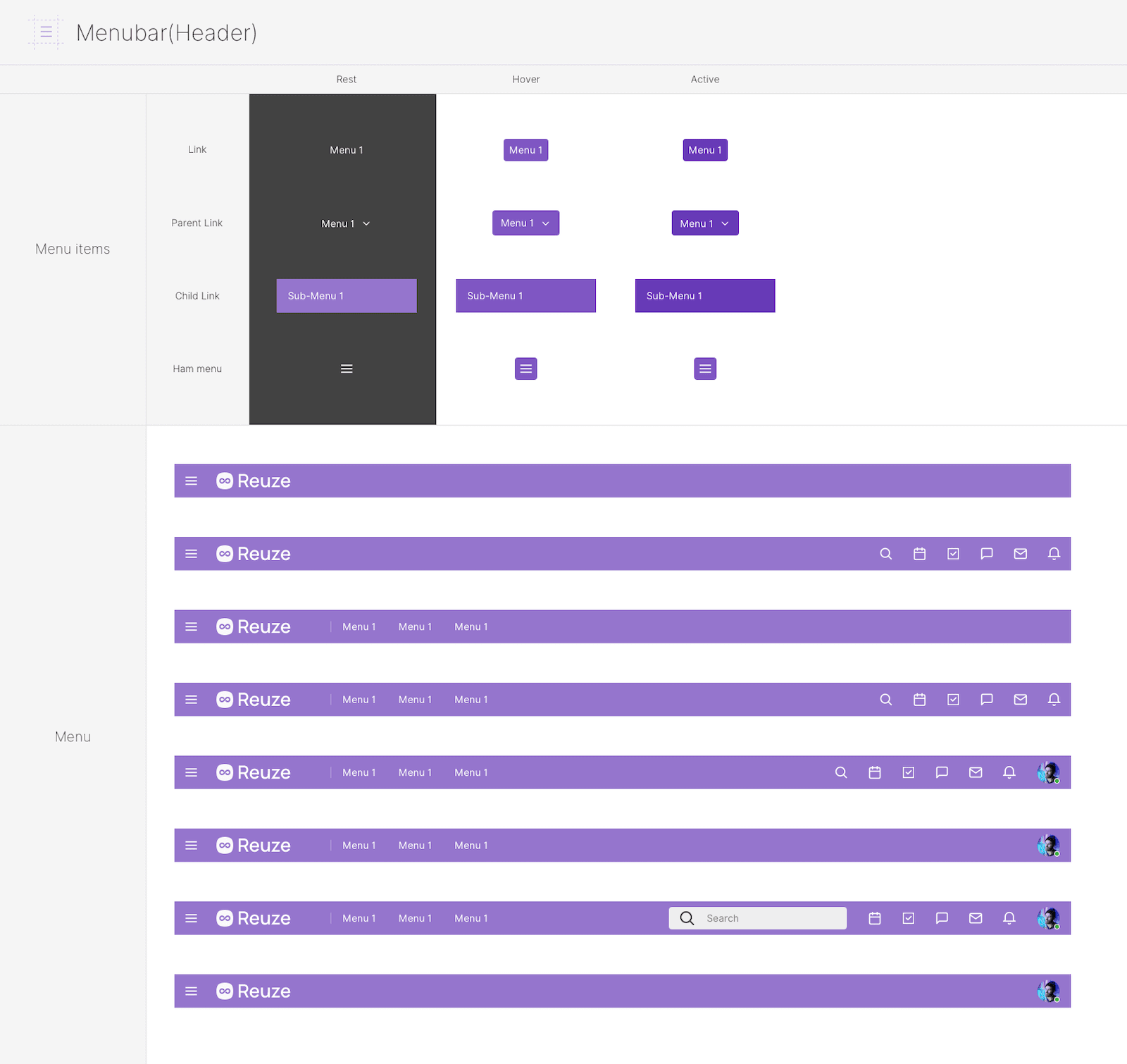
The components are also organized in familiar and common groups for web apps: Headers, Sidebar, Calendar, Chat, File Manager, Mail, To-do. Furthermore, multiple pre-made web apps are available: Dashboard, Calendar, File Manager, Chat, Mail, To-do.
You will be able to choose between Dark and Light versions for all design elements.
-
License
The personal license allows for personal projects for one user. The team license allows for personal and commercial projects for a small team. The professionals license allows for personal and commercial projects on unlimited scale. If you work in a team select the team license that corresponds to your team.
-
-
Highlights
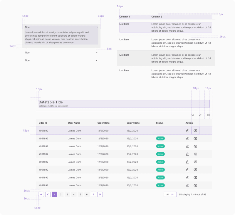
All elements are created with responsive web design in mind and utilize 8pt system and 12 column layout. The atomic design of this kit provides solid methodology and clear expectations.
You will be able to quickly understand the structure and composition of UI elements. This organizational model will allow you to design faster and smarter because the components have the same and predictable foundation.
Furthermore, the consistent naming convention of Layers, Groups, and Symbols will help you identify components quickly.
-
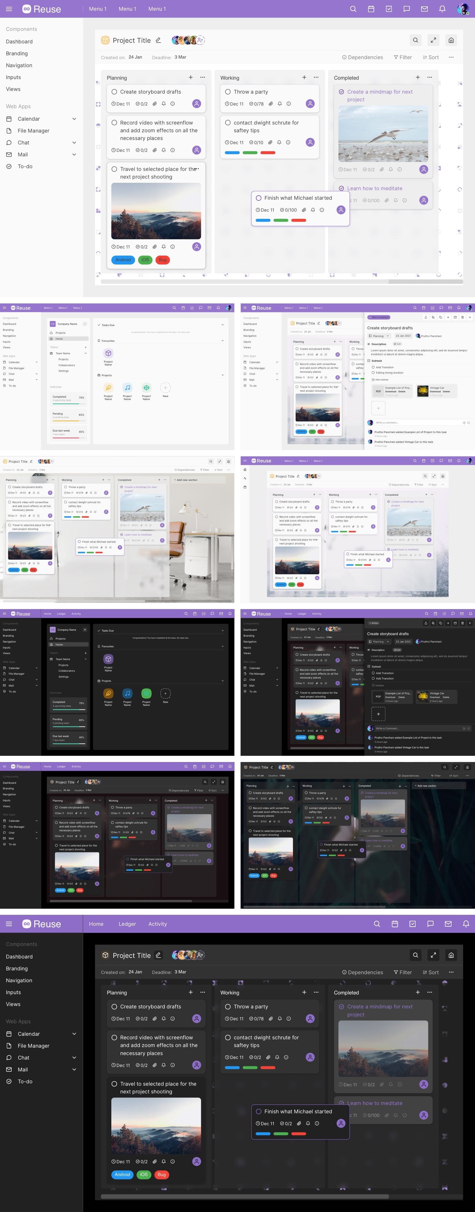
Apps - Boards and Kanban Project Management
-
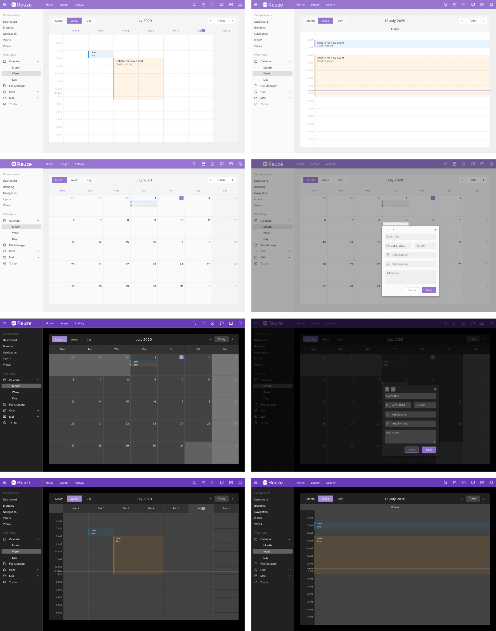
Apps - Calendar
-
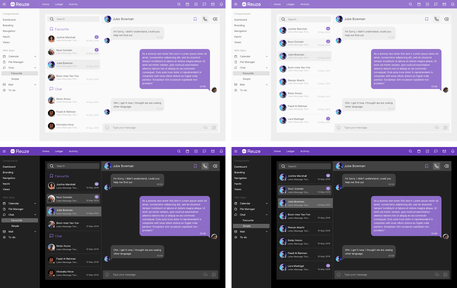
Apps - Chat
-
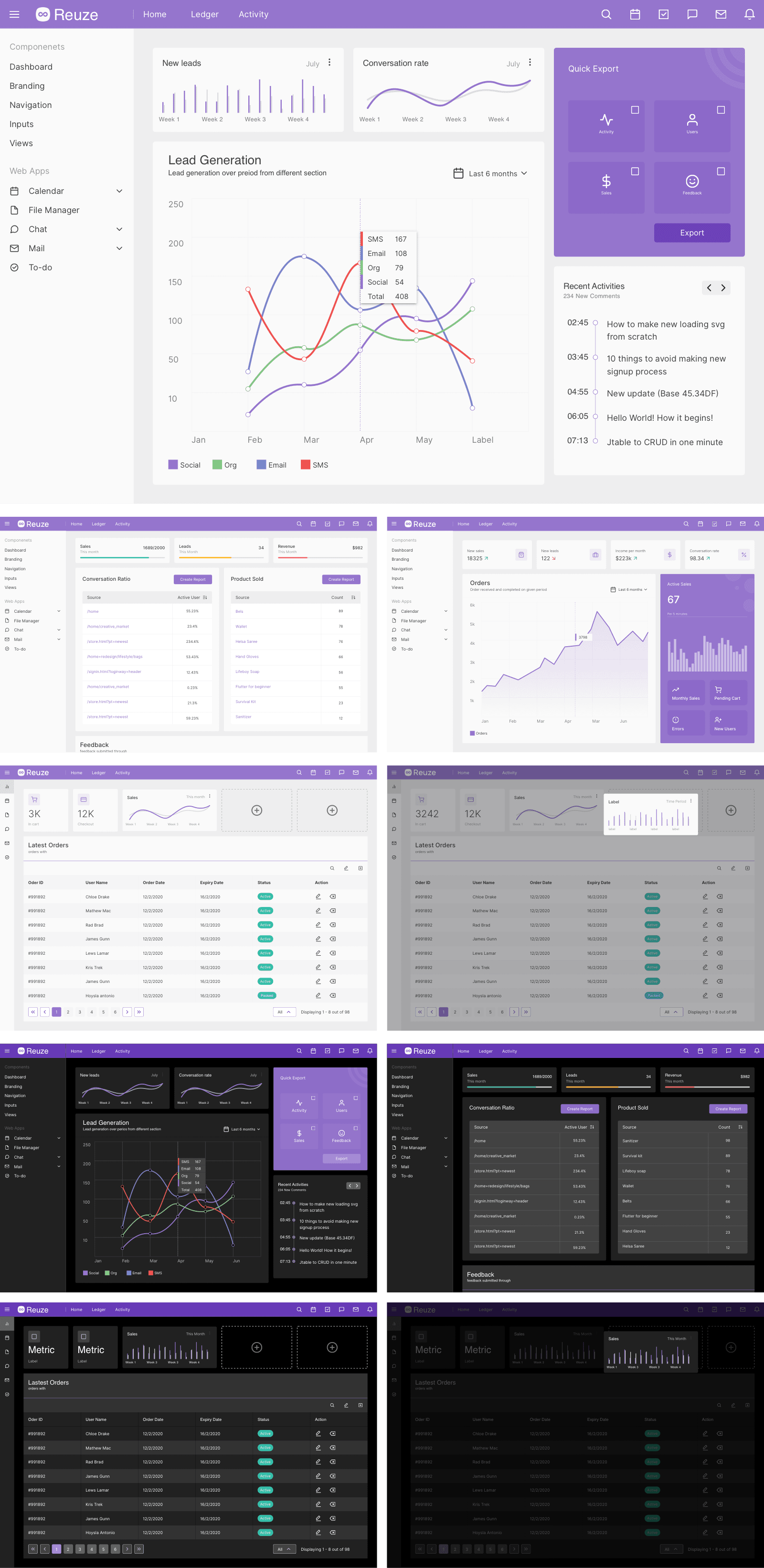
Apps - Dashboard
-
Apps - File Manager

-
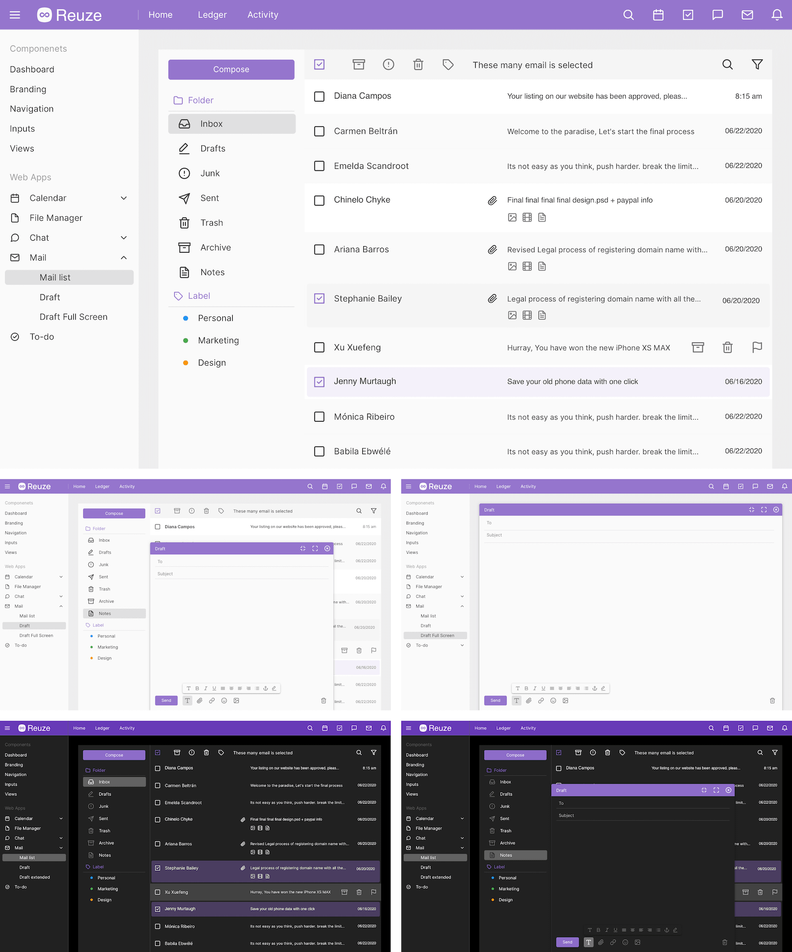
Apps - Mail
-
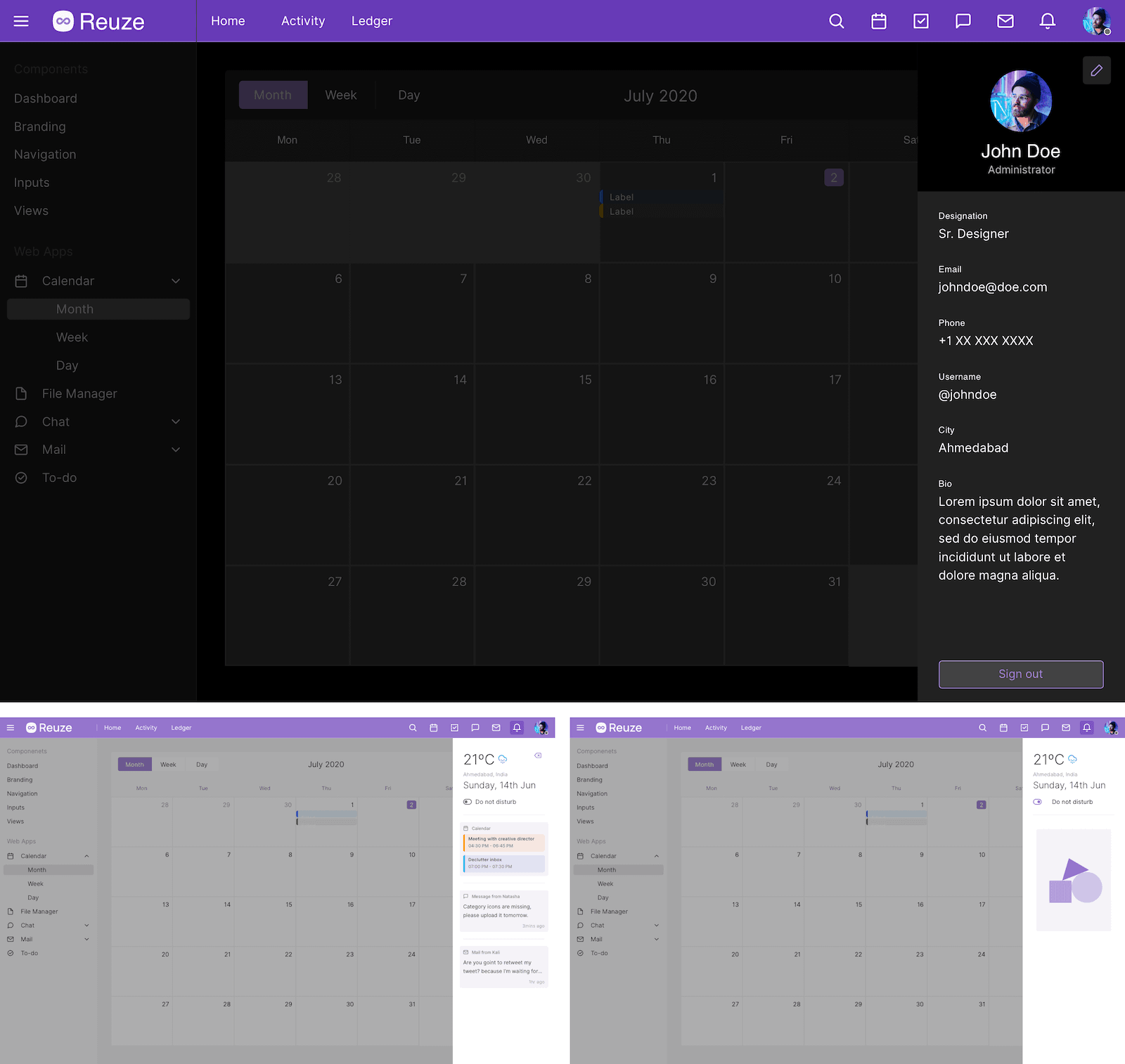
Apps - Notifications
-
Apps - To-do
-
Components - Accordion & Content Switcher
-
Components - Avatar
-
Components - Buttons
-
Components - Chart Elements
-
Components - Charts
-
Components - Code Snippet
-
Components - Controls
-
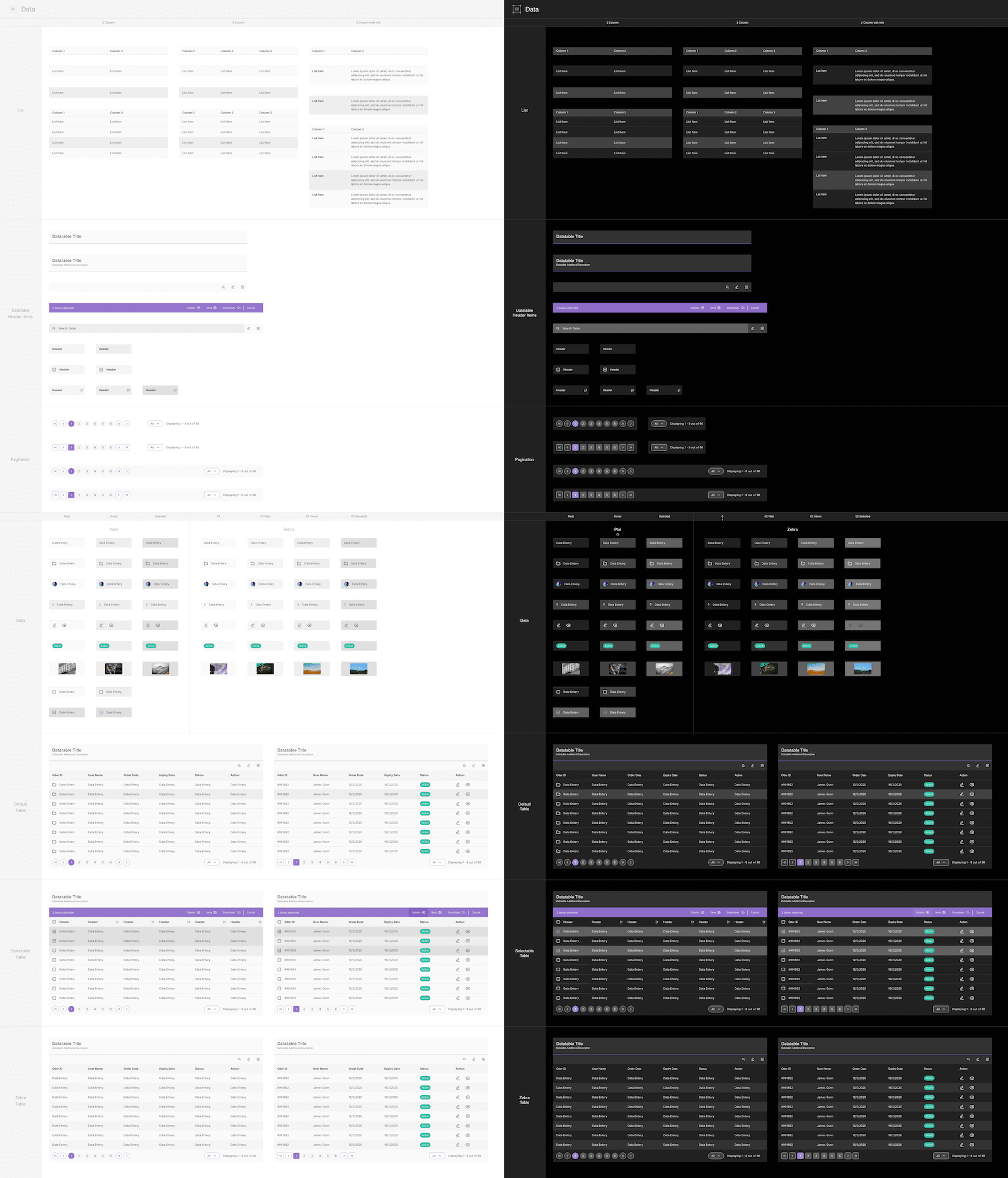
Components - Data
-
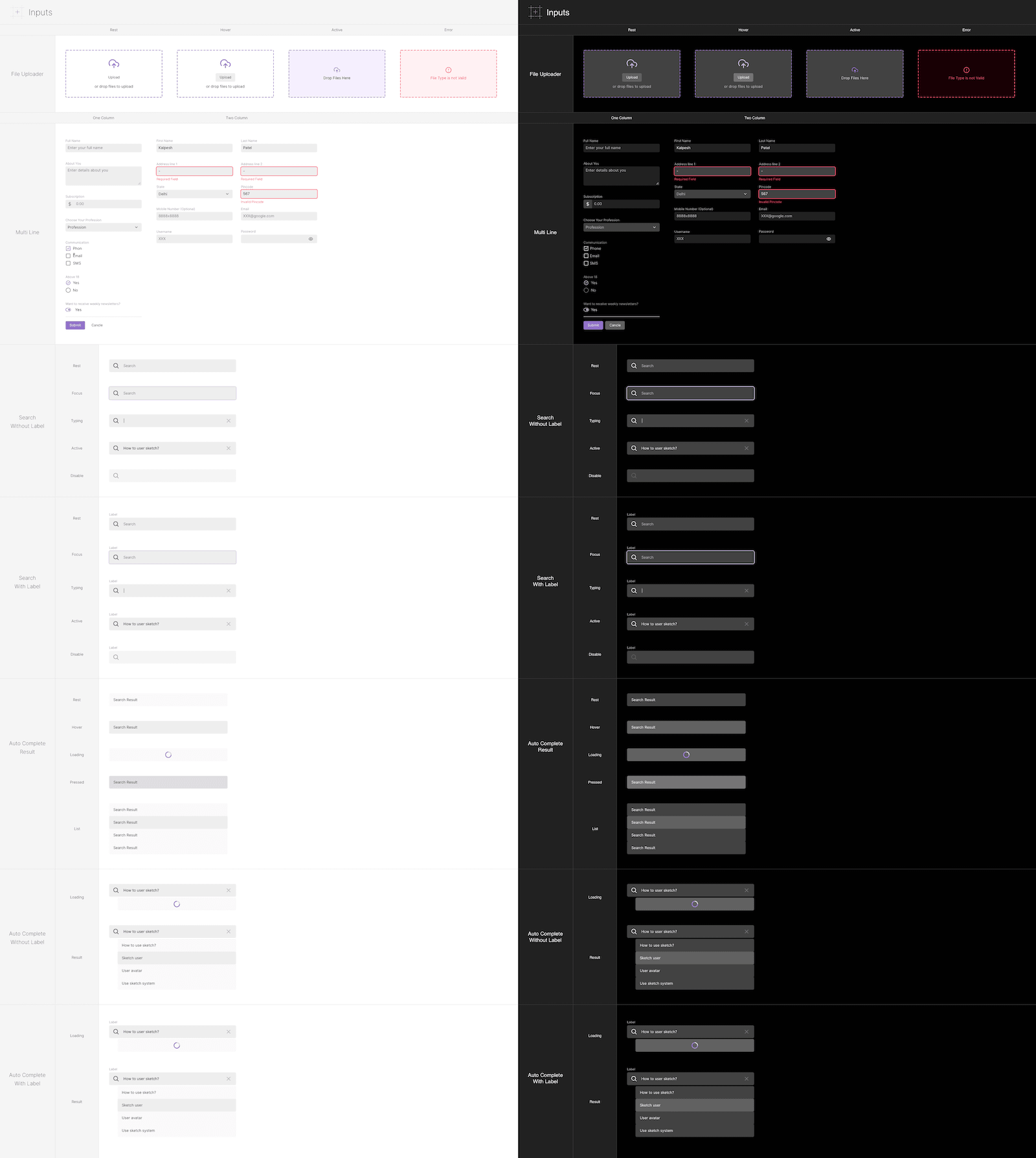
Components - Inputs
-
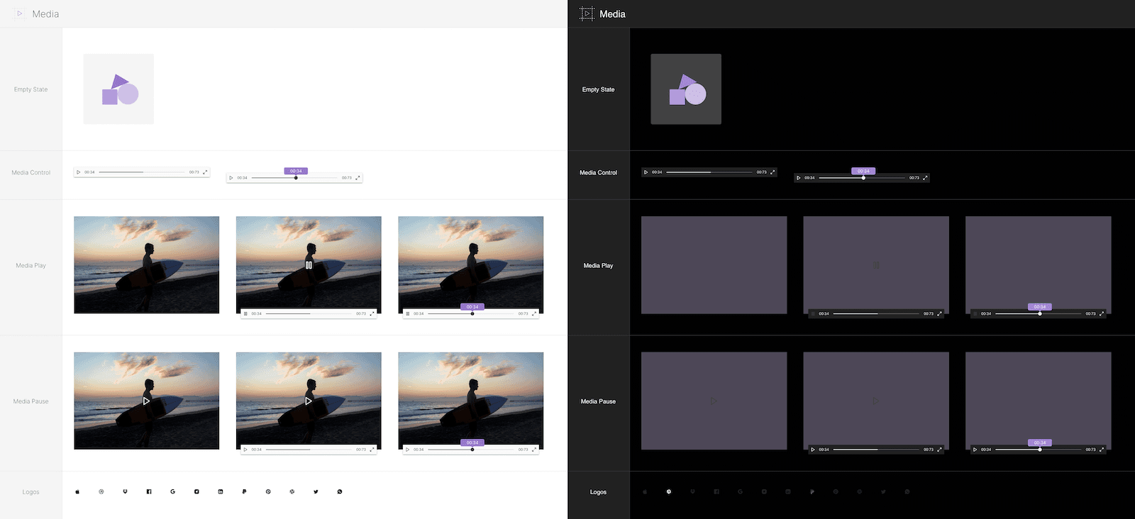
Components - Media
-
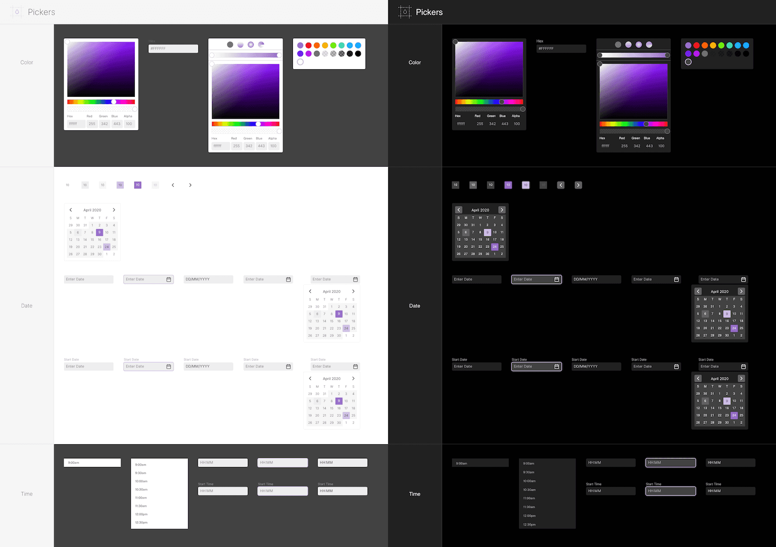
Components - Pickers
-
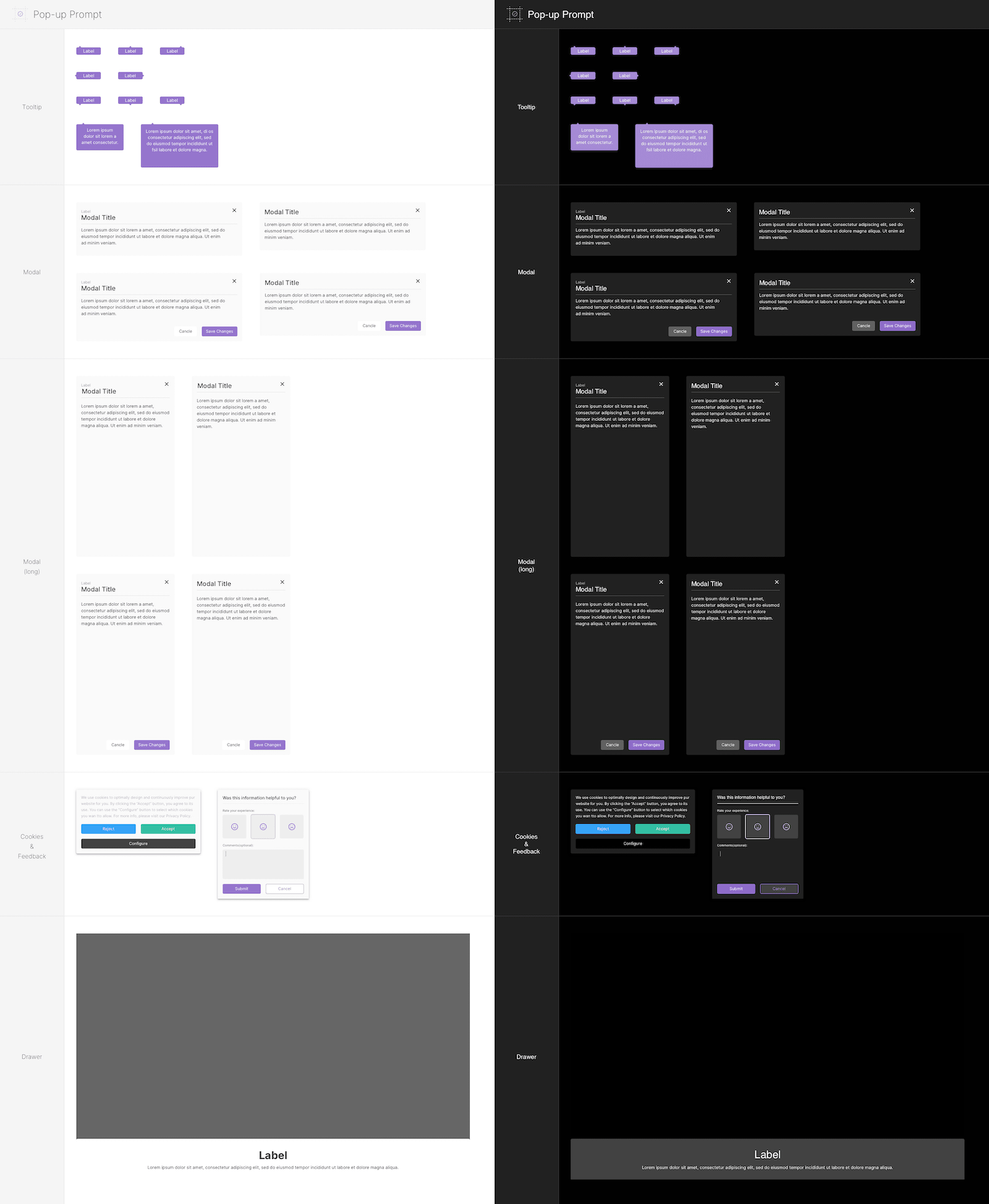
Components - Pop-up Prompt
-
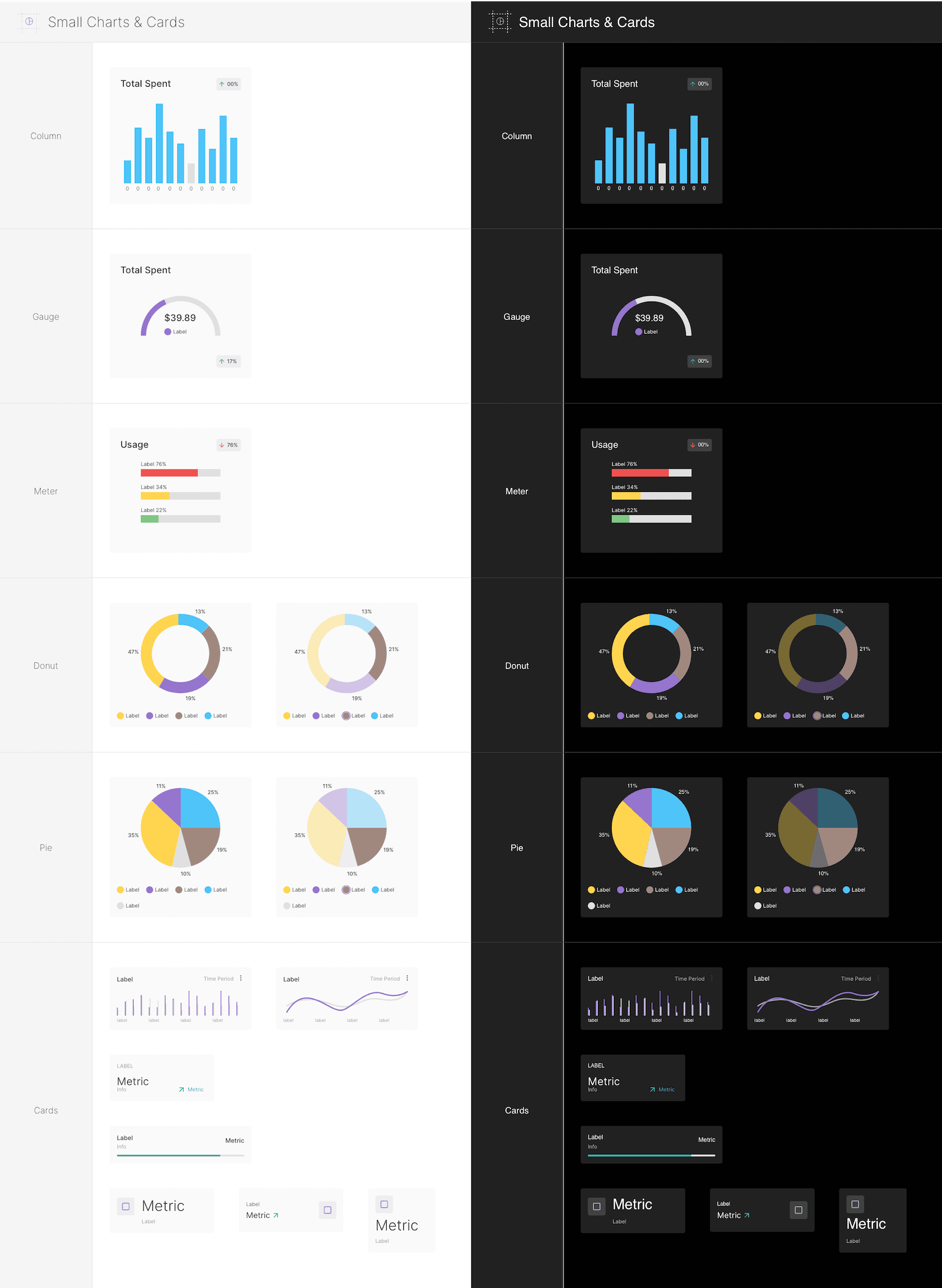
Components - Small Charts & Cards
-
Components - Text Fields (Complex)
6654.png)
-
Components - Text Fields (Normal)
6654.png)
-
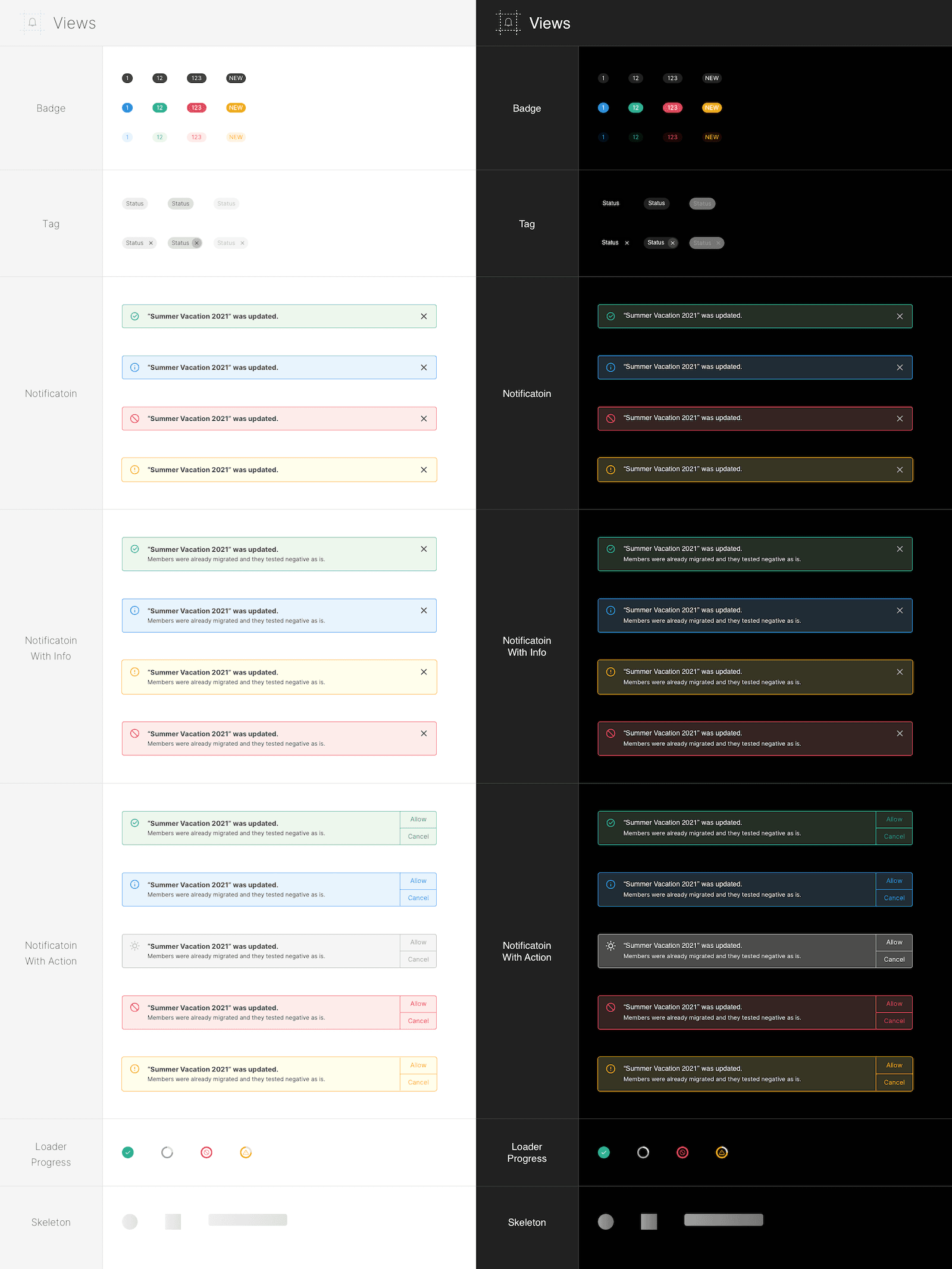
Components - Views
-
Elements - Calendar

-
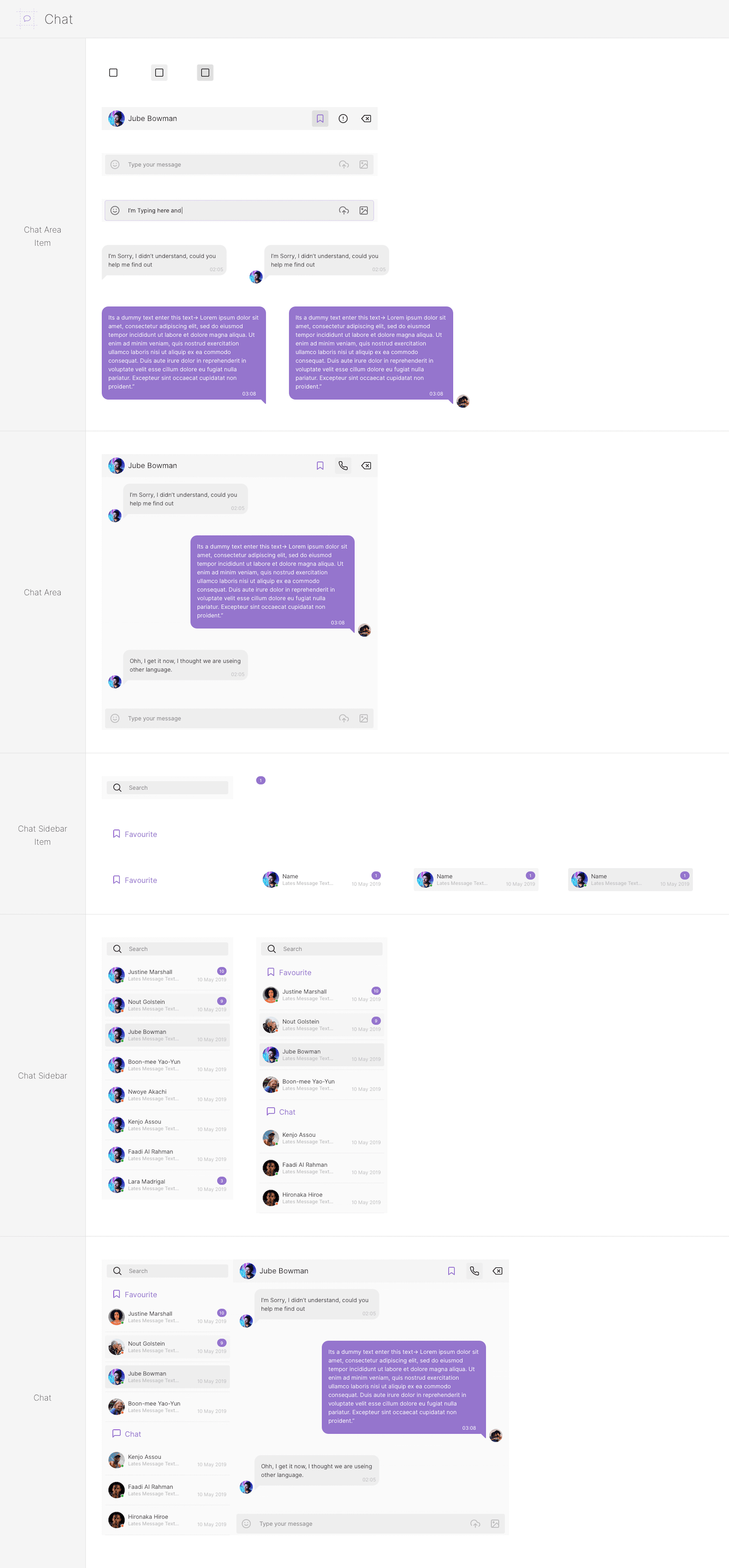
Elements - Chat
-
Elements - Colors
-
Elements - File Manager
-
Elements - Header
-
Elements - Mail

-
Elements - Todo

-
Elements - Typography
